Free Online Productivity Tools
i2Speak
i2Symbol
i2OCR
iTex2Img
iWeb2Print
iWeb2Shot
i2Type
iPdf2Split
iPdf2Merge
i2Bopomofo
i2Arabic
i2Style
i2Image
i2PDF
iLatex2Rtf
Sci2ools
144
click to vote
VIS
2009
IEEE
2009
IEEE
A User Study to Compare Four Uncertainty Visualization Methods for 1D and 2D Datasets
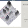
Many techniques have been proposed to show uncertainty in data visualizations. However, very little is known about their effectiveness in conveying meaningful information. In this paper, we present a user study that evaluates the perception of uncertainty amongst four of the most commonly used techniques for visualizing uncertainty in one-dimensional and twodimensional data. The techniques evaluated are traditional errorbars, scaled size of glyphs, color-mapping on glyphs, and colormapping of uncertainty on the data surface. The study uses generated data that was designed to represent the systematic and random uncertainty components. Twenty-seven users performed two types of search tasks and two types of counting tasks on 1D and 2D datasets. The search tasks involved finding data points that were least or most uncertain. The counting tasks involved counting data features or uncertainty features. A 44 full-factorial ANOVA indicated a significant interaction between the techniques used a...
Future Uncertainty Visualization | Random Uncertainty Components | Uncertainty Visualization Design | VIS 2009 | Visualization |
| Added | 06 Nov 2009 |
| Updated | 18 Nov 2009 |
| Type | Conference |
| Year | 2009 |
| Where | VIS |
| Authors | Jibonananda Sanyal, Song Zhang, Gargi Bhattacharya, Phil Amburn, Robert J. Moorhead |
Comments (0)

